Arcadia
Arcadia is a high score tracking, app which facilitates social engagement among friends. This platform allows its users to easily compare their performance with that of their peers by providing a rank feature that generates a comprehensive overview of their standings in various games. Users can also chat and communicate with their friends through the app, making it possible to share high scores and enhance the overall social experience of the app.

My Role
As this is my first project, I was the sole UX designer. I was responsible for creating personas, storyboards, paper and digital wireframes, low and high fidelity prototypes, and conducting competitive analysis, interviews, and usability studies. I also took into account accessibility and best design practices when creating the designs.
Design Process
For this project, I employed the iterative 5-stage Design Thinking Model to guide the process and ensure a user-centered approach.
Empathise > Define > Ideate > Prototype > Test
Empathise
User Research
I conducted surveys and interviews to gain a better understanding of the arcade game playing habits of potential users.
Through this research, I identified a primary user group consisting of teenagers who spend a few hours almost every day in arcade stores. One of the main concerns expressed by these users was the lack of a proper means to share their high scores with their friends. This insight will be valuable in designing an app that provides a communal platform for gaming enthusiasts to share their scores and engage with their friends. By incorporating features such as high score tracking and a ranking system, users will be able to compare their scores with their friends and engage in friendly competition.
Competitive Audit
The competitive audit focuses on comparing the information architecture and navigation features of the applications of two key competitors in the arcade gaming app market: Scorbit and Arcade Galactic.
Scorbit offers a device that connects pinball machines to the cloud and positions itself as a platform serving players, collectors, and operators. Its strengths lie in its value for different user demographics and easy controls.
Arcade Galactic provides physical arcade machines with online score-saving capabilities. It excels in offering classic, cutting-edge, and rare games and emphasizes its role as an iconic provider of arcade entertainment.
However, both competitors have weaknesses to address. Scorbit's app lacks visual appeal and works only with pinball machines, while Arcade Galactic's app is not intuitive and requires website registration.
Identified gaps include the opportunity to enhance the visual appeal and intuitiveness of the apps. There is potential to improve the user interface, design, and contrast ratio, as well as exploring alternative registration methods within the app.
Given the fragmented nature of the arcade gaming app market, there is an opportunity for a new player to succeed by prioritizing user experience and design.
Define
Pain Points
Accessibility: Based on user research, it was found that arcade game players do not have a convenient means to access leaderboards outside of the arcade store. This limitation makes it difficult for players to compare their scores with other players and track their progress over time.
Social: Another significant challenge identified through user research is the lack of a means for players to compare their scores with their friends. Many players expressed a desire to engage in friendly competition and compare their scores with their peers.
Time: Through user research it was also found that players spend a significant amount of time searching for games in which they haven't beaten the high score yet. This process can be time-consuming and frustrating, especially for players who visit the arcade frequently.
Personas
To address these pain points, two personas were created which represented the typical users of our app. Of these two, Wade became our primary persona.

Problem Statement
Wade is an avid gamer who needs to get high scores in all games because he wants to be the best amongst his friends and brag about it.
User Journey Map

Ideate
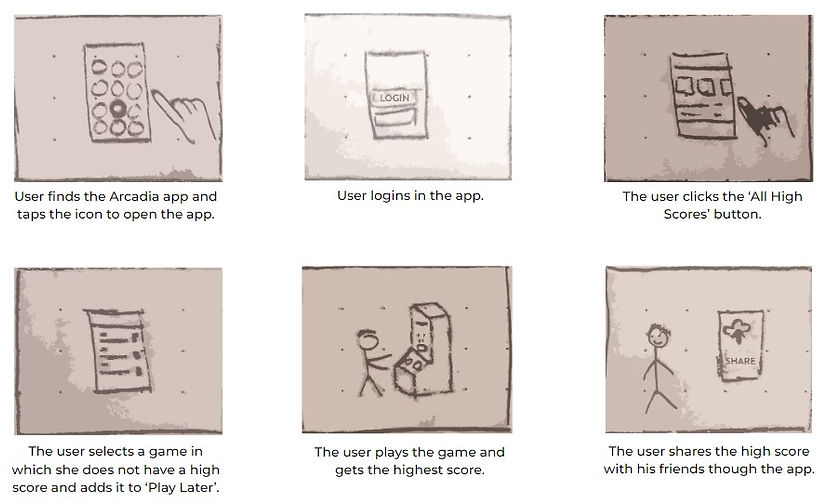
Storyboards
The ideate process began with the creation of storyboards, which visually depict the user's interaction with a product or service. These storyboards proved invaluable in outlining the app's flow and gaining insights into the user journey. I utilized two distinct types of storyboards.
Big Picture Storyboard: These storyboards provide an overview of the app, emphasizing the overall user experience of a product. They are used to visualize the app's flow from start to finish and identify pivotal moments in the user journey.

Close Up Storyboard: These specific storyboards concentrate on the finer details of the product, illustrating how users will engage with specific features or elements. They are employed to provide a visual representation of the user interaction with the application and enhance the understanding of their functionality and usability.
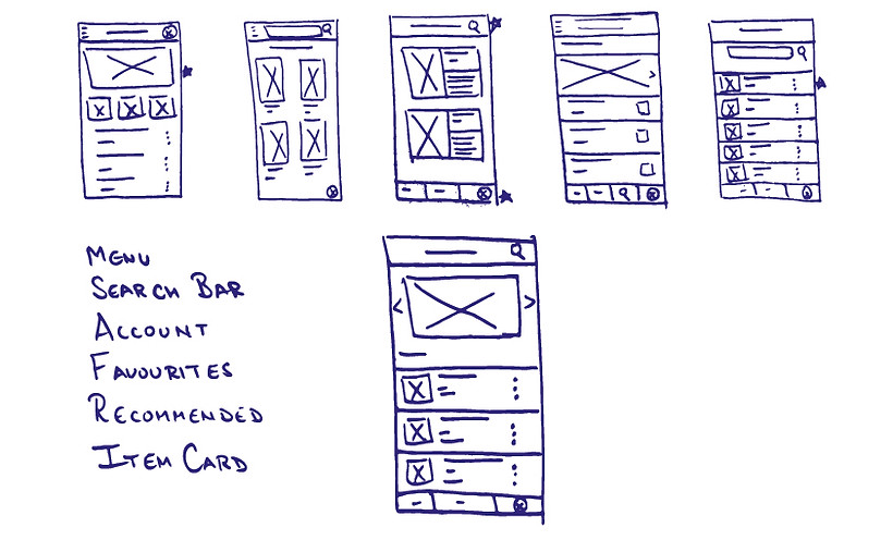
Paper Wireframes
Following the storyboards, I created paper wireframes that helped me in exploring different ideas in a quick time. Initially, I outlined the key elements of an app screen, including the menu, search bar, etc. After that, I generated five different designs for that screen, allowing for diverse options. From these iterations, I cherry-picked the most favorable components and consolidated them into a final screen. This final screen served as the foundation for my digital wireframe.
Prototype
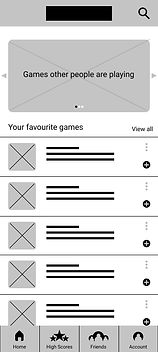
Digital Wireframes
The digital wireframes built upon the designs formulated in the paper wireframes and emphasized functionality rather than the user interface. Important sections of the prototype used actual content instead of a placeholder. The digital wireframes expanded on the paper wireframes by providing additional details. Furthermore, the digital wireframes were more easily shareable, which allowed for easy feedback collection.


Gestalt Principles
The Gestalt principles have been used to group related elements together, create a sense of order, and make the interface more memorable. They enhance the user experience by improving information accessibility by making it easier for users to find information.
Low-Fidelity Prototype
Following the digital wireframes, the next step involved creating low-fidelity prototypes. These prototypes go beyond static wireframes by incorporating interaction and animation, providing a more immersive visualization of the app. By adding this dynamic element, the prototypes offer a tangible representation of the user experience, enabling the identification of potential issues, refinement of design elements, and validation of design decisions.

Test
Usability Studies
Testing is the most important step of the design thinking process as this is where the user comes in. In this part, the user interacts with our product and we gain feedback and insights to improve our design.
For the Arcadia app, once the initial design of the app was completed, a usability study was carried out to refine its design and functionality.
Participants were presented with low-fidelity digital wireframes of the app and were asked to provide feedback. Their feedback played a crucial role in refining the initial mockups and identifying areas that needed improvement. The participants were assigned tasks such as locating and viewing their high scores, connecting with friends, and exploring new games. The feedback collected from them proved instrumental in pinpointing pain points and addressing usability issues in subsequent iterations of the app.
The aim of the usability study was to determine if the navigation of the app is clear enough for users and whether they are able to perform basic functions on the app. The study answered questions like:
-
Is the user able to navigate from the home page to sharing the high scores in multiple ways?
-
How much time does it take the average user to do so?
-
Do users think the app is easy or difficult to use?
-
Is there any part in the app where the user gets stuck?
-
What changes the user would like to see in the app?
-
Does the app benefit the user?
To measure the performance of the participants, Key Performance Indicators(KPIs) such as Time on Task, User Error Rates, System Usability Scale, etc. were used. The data was compiled in a manner which was easier to read and that helped in making better decisions.
The following insights were obtained after the usability study:
-
One issue was the need for confirmation after completing a task to ensure that users felt confident that the task was completed successfully.
-
It was also found that users were having difficulty adding games to their "play later" list because they were looking for a "games" tab instead of a "high scores" tab. This meant that there was the need for better navigation tools to improve user flow and streamline the user experience.
Refining the Designs
Key to successful UX design is iteration. It allows improvement in designs based on feedback from users. It also helps in keeping the biases in check by addressing the real needs of the user which ultimately leads to customer satisfaction.
Mockups
After the first usability study, the design and contents of the menu bar were changed. The ‘High Scores’ tab was changed into the ‘Games’ tab based on the insights gathered. All these changes were reflected in the mockups. Colors, typography, iconography, and images were thoughtfully chosen, with accessibility in mind, to ensure an inclusive user experience.

Some other changes included:
-
Adding the confirmation message which provides acknowledgement to the user that the game has been added to ‘Play Later’.
-
Changing the icon design to a better, modern one.
High-Fidelity Prototypes
After creating the mockups, another usability study was conducted to check if the pain points from the first one have been removed or not. The feedback received from the second usability study suggested that the earlier pain points were removed but there were a couple of new ones and changes were made accordingly:
-
More details were added on the home screen so that the users can go to other screens of the app with a single click.
-
The confirmation message was made more prominent.
These modifications facilitated the creation of high-fidelity prototypes, which included transitions and animations. These prototypes brought the app one step closer to its final form, providing a more realistic representation of the end product.


Accessibility Considerations
Ensuring accessibility is a key focus in the design of the Arcadia app. By incorporating accessibility principles throughout my design process, I aim to provide an inclusive digital experience that can be accessed by users of all abilities.
-
To make the app more accessible, I have implemented features such as readable navigation bars for screen readers. By using a combination of icons and text, users with visual impairments can easily navigate the app.
-
I also understand the importance of catering to different interaction needs. That's why Arcadia offers alternative options to navigate to different screens like swiping, enabling users with physical limitations to interact with the app comfortably. Consideration has been given to animation speed as well. I recognize that users with cognitive or visual impairments may require slower and more deliberate animations to process information effectively.
-
Additionally, color contrast has been carefully considered to ensure readability for users with visual impairments. Following industry guidelines, I strive to create an app that is visually accessible and comfortable for all users.
By prioritizing accessibility, I aim to create an app that not only accommodates users with disabilities but also enhances the overall user experience for everyone.
Going Forward
Impact
Arcadia is an app that provides a platform for gamers to discuss their favorite games with friends and share high scores. From the initial sketches to the final design, every visual choice and interactive element was crafted with accessibility and user-friendliness in mind ensuring everyone can navigate and enjoy the app to its fullest.
Understanding the users' needs through surveys, interviews, and usability studies was crucial in making informed design decisions. My commitment to accessibility involved implementing best practices, including attention to color contrast, offering alternative interaction choices, and ensuring straightforward navigation, making the app inclusive and usable for individuals with varying abilities.
As a result, Arcadia is a user-friendly app that can be used by anyone, regardless of their experience with technology or any physical or cognitive limitations they may have and making it a valuable addition to the gaming community.
What I learned
While working on the Arcadia app as a UX designer, I learned a lot about making things easy for users. From figuring out what people need to testing out ideas, it was a big learning experience. The main thing I took away is that keeping the user in mind at every step is crucial. This experience has given me the skills to create designs that are simple and helpful for users in the future.
Next Steps
-
Conducting another round of usability study: In this round, it would be important to have a new set of users who have not yet interacted with the app to get fresh perspectives. The study should focus on the pain points identified in previous studies to see if the changes made to the app have effectively addressed those issues.
-
Reviewing the working of the app after its release: User reviews are an important source of feedback for improving the app. It's important to read through the reviews carefully and look for common themes or issues that users are experiencing. It's also helpful to engage with users directly by responding to their reviews and asking for more feedback.
-
Conducting further user research: As the app evolves and new features are added, it's important to continue to understand the needs and pain points of the user base. This can be done through surveys, interviews, and other research methods. It's important to keep an open mind and be willing to make changes based on user feedback to ensure the app continues to meet the needs of its users.
Thank you for reviewing my work on the Arcadia app. If you have any feedback or suggestions, please do not hesitate to contact me. I am always open to constructive criticism and value your input.