Pixel Perfect
Logo Design Case Study
A logo is a visual representation of a brand. It is often the first thing that people see, and it can make a big impression. A logo conveys brand's values and by using effective design choices, such as color, typography, and imagery, a well-designed logo can help to build brand awareness, create a positive association with the brand, and make it more memorable.

This case study will walk you through the process of designing a logo for Pixel Perfect, which is my personal brand. We will start by understanding the brand values and target audience. Then, we will brainstorm some ideas for the logo. Once we have a few ideas, we will refine them and create the final logo taking in account color theory and typography.
Research and Discovery
This initial phase involves understanding the brand, its values, target audience, and industry. Conducting research helps identify competitors, trends, and opportunities, providing a foundation for the design process.
About the Brand
A thorough understanding of the competitive landscape allows designers to create a logo that stands out and captures the essence of the brand while being distinctive in the market. This understanding serves as a guiding principle throughout the logo design process, from the initial concept sketches to the selection of colors and typography.
To truly understand a brand and create a fitting logo, it is important to engage in a conversation with the brand representative. This will help you to create a logo that is relevant, meaningful, and memorable.
Striking a balance between gathering sufficient information and not overwhelming the brand is crucial. Instead of bombarding them with an exhaustive list of 50 questions, it is more effective to focus on a curated set of 10-15 questions. This ensures a productive and concise exchange of information.
In this case, as Pixel Perfect is my personal brand, I followed the same approach. By answering a few key questions, I aimed to gain a better understanding of my brand and generate initial ideas for the logo design. This process allowed me to align the logo with my personal vision and ensure it accurately represents my brand identity. Given below are 3 examples of such questions:
What is the mission and core values of your brand?
Creating impactful visual identities that resonate and communicate effectively. With creativity, collaboration, and client satisfaction at the core, my aim is to deliver exceptional solutions that leave a lasting impression.
How would you describe your target audience or ideal customer?
This brand aims to serve a diverse range of businesses and individuals seeking professional logo design services. My ideal customers value the impact of a strong brand identity and are open-minded, responsive, and provide constructive feedback to ensure exceptional logo designs.
Are there any specific symbols, icons, or visual elements that are important to your brand?
While the brand doesn't have specific symbols, I am open to incorporating elements that represent the design industry or various techniques. I welcome creative interpretations that capture the essence of our industry in a visually appealing way. Additionally, since this brand is named after my cat, Pixel, incorporating feline features into the logo design would be a delightful addition.
Concept Development
The next phase is to brainstorm and sketch multiple logo concepts based on the research insights. This phase focuses on generating a range of creative ideas that align with the brand's identity and objectives.
After carefully analyzing the gathered information, a set of keywords were selected to best represent the brand. These keywords reflect the brand's essence, personality, and values. They also serve as a guide to ensure that the logo design accurately captures and communicates the desired brand attributes.

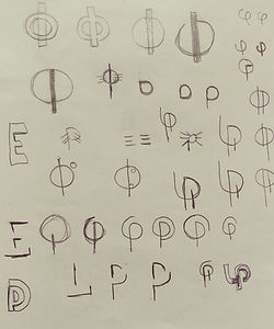
Paper Designs
Moving forward, I translated the selected keywords into a tangible design concept. Exploring the golden ratio's symbol, known for its harmonious proportions, I aimed to represent the brand's balance, beauty, and precision.
In this phase, quantity mattered more than quality. I generated a variety of logo ideas, even if they seemed unconventional. Drawing inspiration from cats, I experimented with incorporating cat ears, whiskers, and feline motifs. This exploration expanded the creative possibilities, offering a diverse range of logo options to consider.
Lastly, I tried to incorporate Hindi script into some of the designs.


Digital Drafts
Now it's time to transition the designs from paper to digital software. After reviewing the paper designs, I carefully selected 2-3 designs that I felt best captured the essence of the brand. Utilizing Adobe Illustrator, I transformed these chosen designs into digital creations. Among them, these two designs particularly stood out to me.


After conducting additional research and careful consideration, the first logo was deemed the most suitable choice for the brand and officially selected as the logo for Pixel Perfect. Now, let's delve into the meaning behind this captivating logo design.
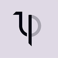
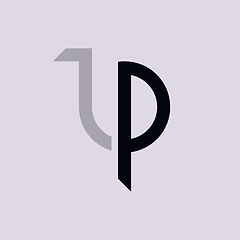
The first image showcases a letter in Devanagari (Hindi) script, symbolizing the first letter of the brand name "Pixel Perfect" in Hindi. The second image features the letter P, representing the term "Pixel” or “Perfect" within the brand name. The overall logo design features the lowercase phi symbol, representing the golden ratio. By dividing the logo into two distinct parts, we introduce a new dimension to its composition. This separation adds visual interest and prevents the logo from appearing monotonous or mundane.
Adobe Illustrator served as the creative tool for crafting the logo design. To achieve the desired geometric style, grids proved to be an invaluable framework in the logo creation process. They provided structure and precision, enabling the development of a clean and visually pleasing geometric logo.


Choosing the Colors
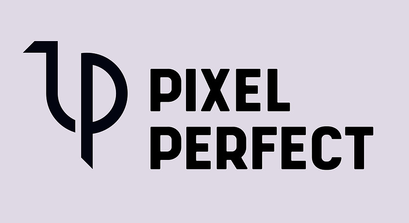
When it came to choosing the colors for the logo, I opted for the timeless combination of black and white. However, to add a touch of uniqueness, I made slight adjustments to the shades of black and white. The result is a refined color palette that enhances the logo's overall aesthetic and visual impact.

HEX: #DFD9E5
RGB: (223, 217, 229)
HSB: (270, 5%, 87%)
HEX: #020410
RGB: (2, 4, 16)
HSB: (231, 88%, 4%)
In addition to this particular color variant, I believe that the logo possesses inherent versatility when it comes to color. Multiple colors can be explored to suit different contexts and applications, ensuring that the logo remains dynamic and visually engaging across different mediums.

Finding the Font
I used a sans serif font, Shrimp with all capital letters because it conveys a sense of modernity, simplicity, and boldness, which aligns perfectly with the brand's aesthetic and personality. The clean and minimalistic nature of a sans serif font creates a sleek and contemporary look that is visually appealing. The use of capital letters enhances the impact and legibility of the text, making a strong and confident statement.

Moreover, this font offers excellent readability, especially at smaller sizes or when viewed from a distance. This ensures that the logo remains clear and recognizable across different platforms and mediums, whether it's displayed on a website, printed on stationery, or scaled down for social media profiles.
Making Mockups
No logo presentation is truly complete without the inclusion of captivating mockups.
So, here are a few mockups showcasing the logo in various real-world contexts.


Thank You
Thank you for taking the time to review my work. If you are in need of a logo design, I would be delighted to assist you. Please feel free to contact me at shivansh314@outlook.com.
I have also crafted a variety of other logos and illustrations. Take a moment to explore them.
Attributions for Mockups:
asylab / Freepik
mego-studio / Freepik