First Aid Strategies and Tactics
Introducing the FAST app: your ultimate emergency companion, equipping you with vital first-aid information and tools to respond promptly and effectively. It also offers a direct connection to professional emergency services if required.
Don't worry if you lack first-aid expertise; this app is designed to educate and empower every user with essential life-saving protocols. Master the art of handling emergencies confidently and become a true life-saver.


My Role
As the UX Designer, my key responsibilities encompassed crafting personas, storyboards, paper and digital wireframes, low and high fidelity prototypes. I conducted competitive analysis, interviews, and usability studies, while ensuring designs adhered to accessibility and best practices.
Design Process
To drive a user-centered approach, I embraced the iterative 5-stage Design Thinking Model throughout the project. Figma served as the primary software for crafting designs.
Empathise > Define > Ideate > Prototype > Test
FAST
User First
The first step in a UX project is to understand the problem, which is essential for creating successful and user-centric designs. This involves conducting research, gathering data, and empathizing with the target users to gain insights into their needs, pain points, and goals. By understanding the problem thoroughly, designers can identify opportunities for improvement and create solutions that meet users' expectations and requirements. This user-centered approach lays the foundation for a successful UX design process and ensures that the final product addresses real user needs effectively.
User Research
As the first step, I conducted user research, which included surveys and interviews, to understand the users' level of first aid knowledge and proficiency. During the user research, it was observed that the majority of the participants faced challenges in administering first aid effectively. They expressed that an app guiding them through first aid procedures would have been beneficial.
When we asked what they wanted in the app, most said it should be simple and offer easy first aid solutions. They suggested adding CPR and seizure care procedures. Some also wanted an emergency call button and the app to work offline.
Pain Points
Based on the user research, some pain points of the users include:
-
Lack of first aid knowledge: Users expressed challenges in administering effective first aid due to limited knowledge.
-
Need for guidance: Many participants felt that an app providing step-by-step guidance on first aid procedures would be helpful.
-
Difficulty in applying first aid: Users faced challenges in correctly applying first aid techniques without proper guidance.
-
Potential for mistakes: Limited proficiency in first aid might lead to mistakes during emergency situations.
-
Desire for a solution: Users sought an app that could empower them with the knowledge and confidence to handle emergencies effectively.
Personas
The research also identified a key demographic: regular students and commuters who are more likely to encounter individuals requiring immediate medical assistance. A primary concern expressed by these users was their lack of knowledge and expertise in administering proper first-aid treatment during emergencies.

In addition, the target audience extended to individuals who interact with kids/students daily, like school teachers, kindergarten teachers, bus drivers, etc. Lack of or a gap in the teachers' first-aid knowledge could pose a significant challenge in emergency situations where time is of the essence. However, with the app, I aim to create a solution that can provide quick and easy access to essential first-aid protocols via smartphones or tablets.
Problem Statement
Jocelin is a school teacher who needs an easy way to know about the first aid procedures because she wants to be there and help her students in case of an emergency.
Starting with the designs
Crazy Eights
Crazy Eights is a rapid ideation exercise used to generate multiple design ideas quickly and creatively. The goal is to produce a variety of ideas without overthinking or being overly critical. It involves folding a piece of paper into eight sections and setting a timer for eight minutes to draw out eight different design concepts, one in each section.
The below given example shows the crazy eights method I used to generate quick ideas for different pages of the app.

The Crazy Eights exercise is an exciting design ideation exercise that is great to get ideas flowing and generates a lot of ideas in a small amount of time. It forces you to think outside the box because you have to come up with many ideas in a short timeframe, without judging them. This means that many a times you will have lots of unique, nontraditional solutions to consider.
Paper Wireframes
A user-friendly, single-column, vertical interface has been selected to display the first-aid instructions in a clear and concise manner. This design choice ensures that users can quickly and easily follow the step-by-step procedures, even in high-stress situations. By keeping the interface simple and intuitive, users are empowered to provide timely and effective first-aid treatment to those in need. More details in the prototypes

Prototyping


Digital Wireframes
The digital designs were built upon the initial paper wireframes, which were generated using the "Crazy Eight" technique. Here's a brief description of the app's design:
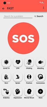
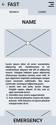
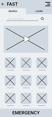
Upon opening the app, users encounter the Login/Sign Up screen with an option to skip. The home page features two tabs on the top: "Search" and "Learn." Below, there's a search option to find specific first aid procedures quickly. The main content on this page includes a hero image/video and a grid of icons for easy access to common injuries and first aid procedures, with the option to view more.
Clicking on an icon leads to a specific procedure page, presented in a single, scrollable column for user convenience. This page offers step-by-step instructions accompanied by relevant images and videos.
Notably, the app includes an "EMERGENCY" button at the bottom of the screens. Pressing this initiates a call to emergency services. To prevent accidental calls, a short delay occurs before the phone app opens, and a prominent cancel button provides the option to abort the call before it starts.
Low-Fidelity Prototype
Low-fidelity prototypes elevate the digital wireframes by adding interactivity and dynamic animations, bridging the conceptual gap between initial designs and the ultimate product. By integrating these elements, the prototype evolves into a more realistic representation, enabling users to engage with the interface as they would with the final application. This interactive experience not only refines the user journey but also encourages users to provide precise and valuable feedback.

Testing
Usability Studies
After the low fidelity prototypes, I conducted a usability study to fine-tune both design and functionality of the app. The user input played an important part in highlighting the pain points in the app’s usage. This step is essential for a positive user experience. Testing with users and making changes helps fix issues with how the app looks and works, ensuring a seamless experience.
The aim of the usability study was to determine if the app is intuitive and the users are able to easily navigate through the app. The main focus was to know whether the size of different elements on the screen is optimal. The study answered questions like:
-
Is the user able to navigate to specified problems in a reasonable time frame?
-
Is the user able to call the emergency services in a timely manner?
There were also some general questions like:
-
Do users think the app is easy or difficult to use?
-
Is there any part in the app where the user gets stuck?
-
What changes the user would like to see in the app?
-
Does the app benefit the user?
By tracking user performance through KPIs like Time on Task, User Error Rates, System Usability Scale, we gained valuable insights. We then organized this data into an easy-to-understand format, allowing us to make data-driven decisions that ultimately improved the app's performance.
The following issues were identified after the usability study:
-
One issue was that the log-in/log-out options were confusing to many users.
-
Users found some elements, particularly the emergency button, to be poorly positioned or sized.
Iterating
Iteration is the basis of successful UX design. It puts users at the heart of the process, letting their feedback guide continuous improvements. This feedback loop not only removes designer bias but also ensures the design truly meets user needs, leading to happy customers.
Mockups
After the first usability study, two major changes were made to the app. Firstly, the log in process was totally scrapped off. Earlier, user had to choose to log in or skip when they first open the app. This could hinder quick usage of app in emergency situations.
Another change was in the positioning and size of the elements on the home screen. Prominently, the ‘Emergency Button’ was revamped and moved to the top of the home screen. This would provide better visibility to it and prevent accidental touches.

Some other changes included:
-
Removing the top nav bar as it was just taking up real estate which could be used in a better way. Instead a menu bar was added with different options.
-
Modifying the grid design to incorporate more icons on the home page.
High-Fidelity Prototypes
Following the development of mockups, I conducted another usability study as a follow-up to the initial round of evaluation. It aims to assess whether the changes made based on the feedback from the first study have effectively addressed the identified issues. This iterative process helps ensure that the user experience is continuously refined and improved, catching any new problems that may have emerged and making necessary adjustments.
After the second usability study, we found a few more places where we can make changes in the app. These are as follows
-
Solutions to more diseases/problems were added.
-
Other useful pages such as quizzes, bookmarks were added to the app.
-
A splash screen was incorporated in which is shown when the app is launched.
All these changes were incorporated in the high-fidelity prototype. The high-fidelity prototype also included transitions and animation which not only make the app more aesthetic, but also makes the user experience more enjoyable. Here are some of the screens from high-fidelity prototype.


Making FAST Accessible for all
The design of the FAST app places a strong emphasis on ensuring accessibility. I sincerely believe that everyone should have an inclusive and enjoyable digital experience, regardless of their abilities. That's why I've woven accessibility principles throughout the design process.
-
One of FAST's key features is its complete lack of internet dependence. All information is readily available on the user's device, making it incredibly useful in areas with unreliable or non-existent internet connectivity. This offline functionality also eliminates the need for costly data plans, further enhancing its accessibility.
-
The FAST app is also screen reader-friendly. Combining icons and clear text ensures users with visual impairments can navigate smoothly with the help of screen readers.
-
Recognizing diverse interaction needs, FAST offers alternative navigation options like swipes, long presses, etc. This allows users with physical limitations to interact comfortably and effortlessly with the workings of the app.
-
Animation speed has also been carefully considered. Slower, more deliberate animations cater to users with cognitive or visual impairments, giving them ample time to process information.
-
Color contrast is another crucial factor. I've followed industry guidelines to ensure high readability for everyone, including those with visual impairments.
By prioritizing accessibility, I'm not only addressing the needs of users with disabilities, but also enhancing the overall user experience for everyone.
Going Forward
Impact
The FAST app was created to provide the public with quick first aid information and access to emergency services. Emphasis was given on accessibility and visual design throughout the design process to ensure that the app is user-friendly and easy to use for everyone.
By conducting surveys, interviews, and usability studies, I gained valuable insights into the needs and preferences of our target users, and used this information to inform my design decisions. I also took into account best accessibility practices, including color contrast ratios, alternative options for interaction, and clear navigation tools, to make the app more inclusive and accessible for users with different abilities.
The outcome is FAST- an app welcoming to users of all backgrounds, experiences, and abilities, enhancing community well-being.
What I learned
As the UX designer responsible for the FAST app, I gained invaluable experience and knowledge encompassing the entire UX design process, from initial research and analysis through prototyping and rigorous testing. This experience underscored the paramount importance of user-centric design, placing the user's needs and preferences at the heart of every design decision. The knowledge and skills acquired through this process have equipped me to create effective and user-friendly designs in all future endeavors.
Next Steps
-
Conducting Another Round of Usability Study: In this phase, involving a new set of users unfamiliar with the app is important for gaining fresh insights. The focus should be on previously identified pain points to evaluate the effectiveness of recent app modifications.
-
Reviewing the Working of the App After Its Release: User reviews serve as valuable feedback for app enhancement. Thoroughly examining reviews helps identify common issues or themes. Engaging with users through responses and seeking additional feedback contributes to ongoing improvement.
-
Conducting Further User Research: As the app evolves, ongoing user research, including surveys and interviews, remains essential. Maintaining an open mind and adapting based on user feedback ensures the app consistently meets user needs.
Thank you for reviewing my work on the FAST app. If you have any feedback or suggestions, please do not hesitate to contact me. I am always open to constructive criticism and value your input. You can reach me at the email address provided below.